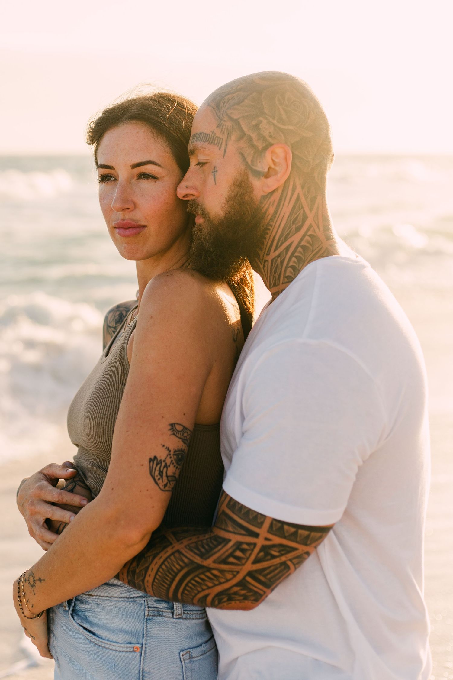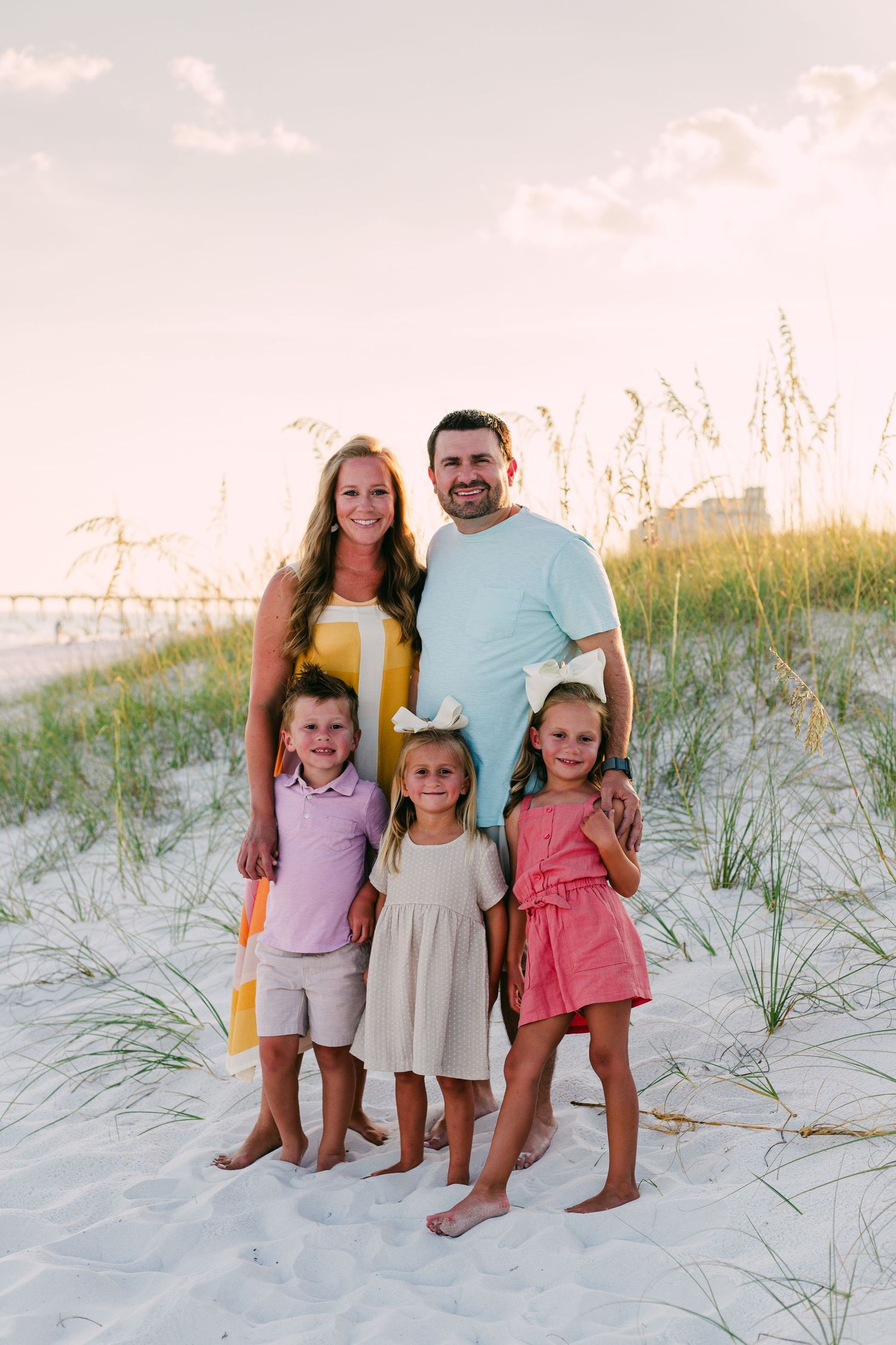
Dressing yourself in the morning is hard enough when you don't have to stand infront of a camera and be your best self. Choosing what to wear for a photoshoot can be triggering even the most confident, fashionista pull their entire wardrobe out onto the floor in search for the perfect outfit. So if your nerves start to fizz when you think about what to wear, don't worry. This is SO normal! Before you lose sleep to late nights spent online shopping - putting articles of clothing in your cart only to take them out again - lets talk about what works and what doesn't. Number one thing I want you to remember. Being comfortable is EVERYTHING! You should look and feel yourself, first and foremost.
Match Your Outfit to the Location and Season
Plan your outfits around what you know about the conditions at the location we'll be shooting at. You'll want to be warm or cool enough, pain free feet and look relatively native to your environment. Think through your clothing choices logically based on location, vibe and comfort level.
Tip: maybe don't wear all black on a stinkin hot day, just trust me on this one
Color Scheming
Aim for neutrals, earthy tones and metallics. These colors complement the outdoor environment almost anywhere you go and look damn fine as a printed, framed photograph.
Don't get me wrong, I'm not advocating for a beige world of quiet and inoffensive colors. By neutrals, I just mean softer tones. Primary colors are incredibly striking, but can sometimes have the effect of detracting from the main subject (which is you). So for example, instead of electric blue, go for something closer to sky blue. Instead of bring orange, opt for ochre or apricot.
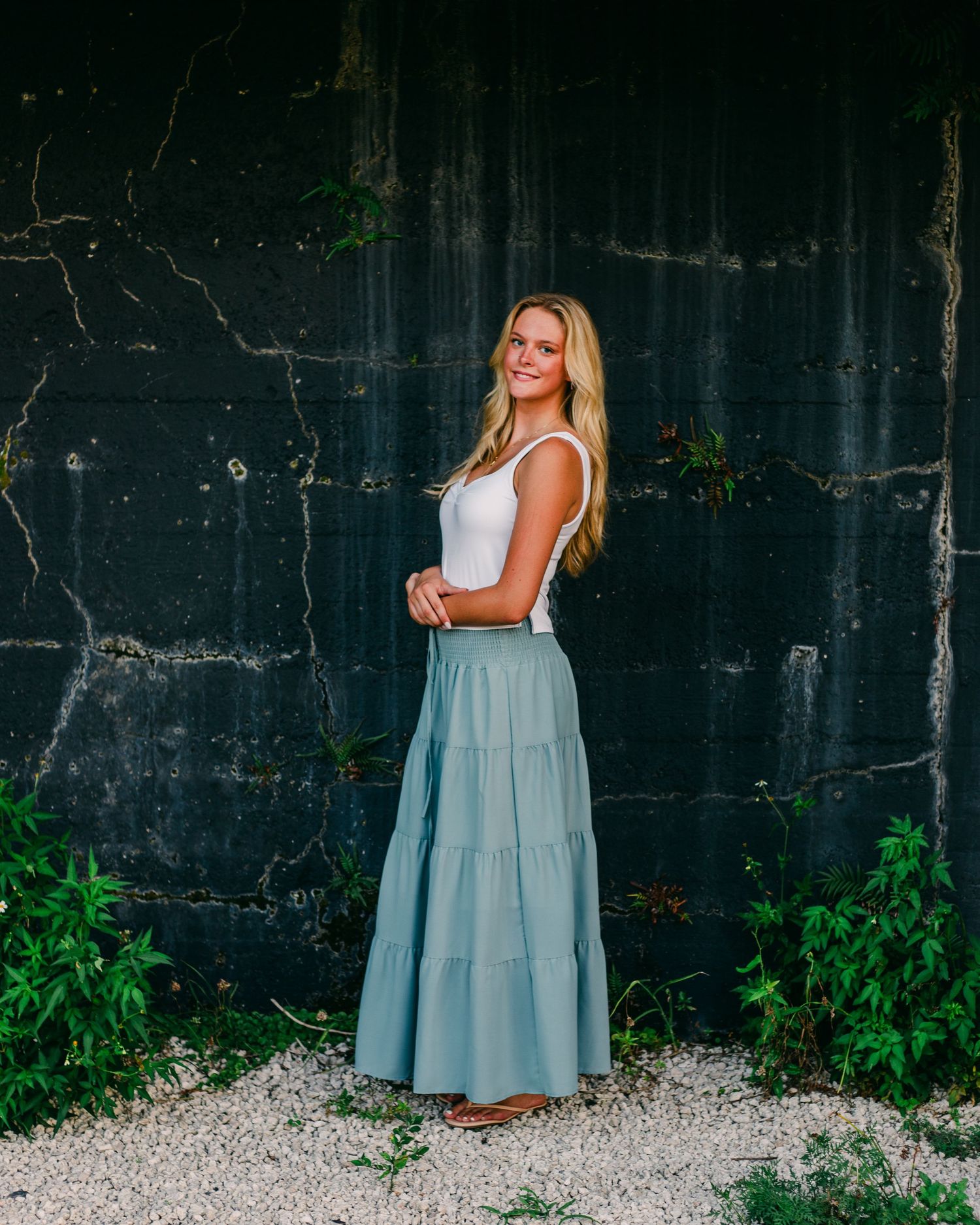
A rule of thumb here is to choose to either complement your natural environment or contrast it. A mustard dress in a deep green forest will look epic, whereas a bright pink, patterned dress doesn't really fit in with your surroundings. It totally depends on what you're looking for.
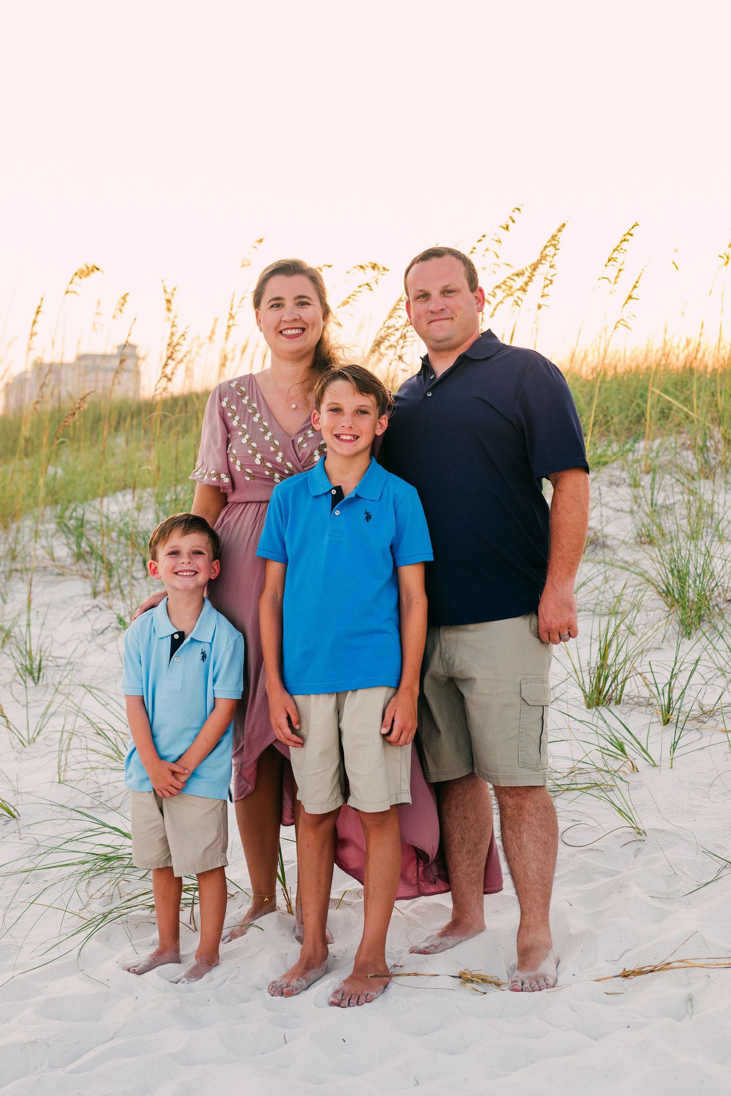
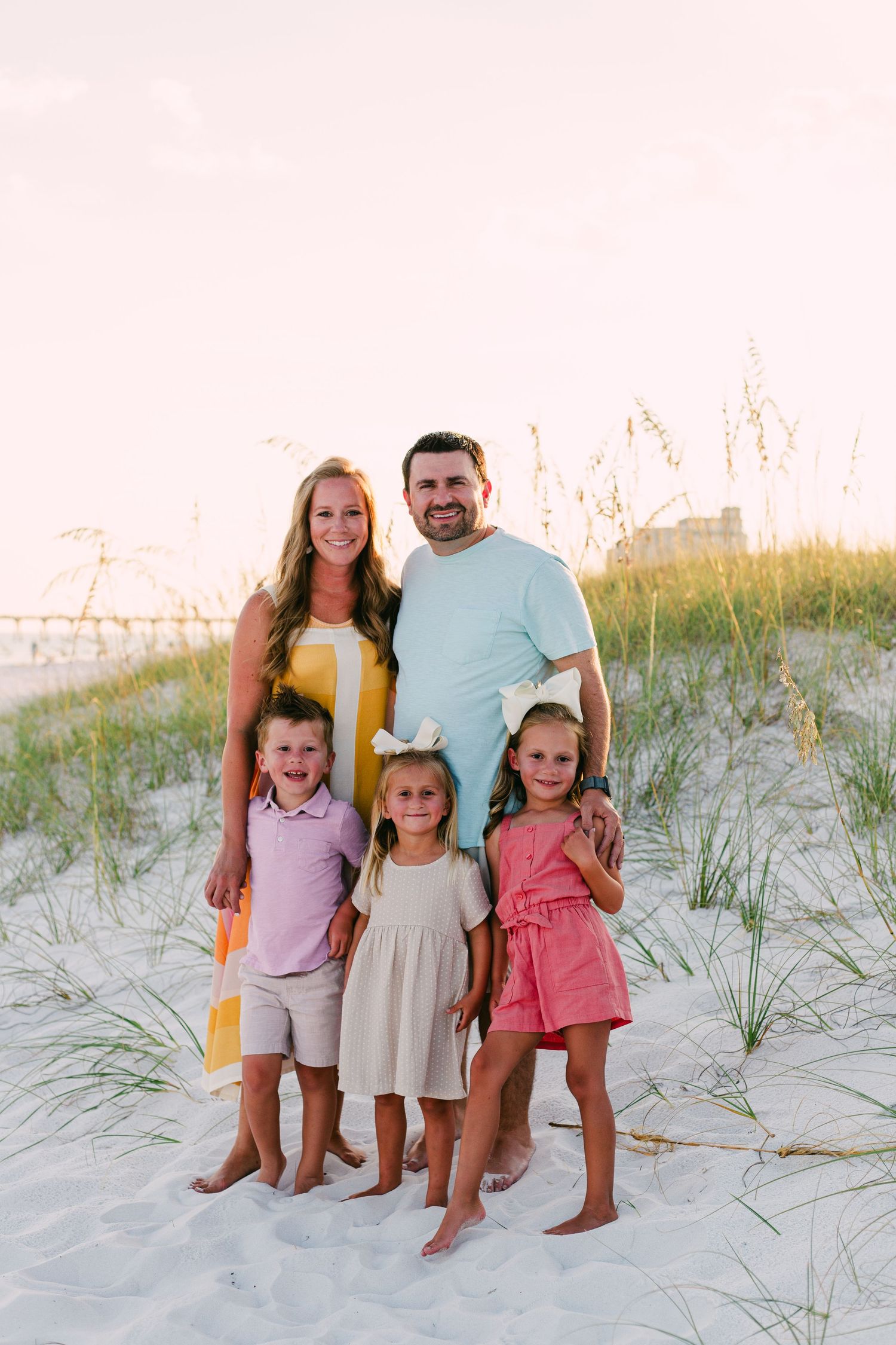
For families, it's best to keep your color scheme limited to four colors. You can choose one person to wear a feature color and have everyone else's outfits complement that.
Color Theory In Action
Remember the color wheel from 6th grade art class? Maybe you've gladly left your middle school days in the past, but the color wheel comes in handy when making good color decisions (aka planning what to wear). The color wheel is a great reference point when trying to figure out what colors look a bit weird together and what colors are a match made in heaven.
Complementary Colors
These colors, the ones that look incredible together, are called complementary colors. They complement each other and create a visual harmony. They're salt and pepper, Bonnie and Clyde, peanut butter and jelly. Complementary colors sit across from one another on the color wheel (i.e. blue and orange, red and green, yellow and purple).
Analogous Colors
But its not all about contrast. We're all built so differently and respond to colors combinations differently.
For those less taken by the "pop", analogous colors could be the way to go. Analogous colors are next to each other on the color wheel and can be quite soothing to the eye. Think of the jungle and all of the lush variations of green, or the ocean and the infinite hues of blue.
Complementary, good! Matching, bad!
Complement each other, don't match each other. You don't want to create the illusion of being your partner's Siamese twin. When multiple people wear the same color sometimes their matching outfits blend in together so much that you can't see any of them properly. The viewer can't tell where one person begin and another ends. They turn into one uniform blob.
In order for the aesthetics of your photograph to really sing, you want to find complimentary outfits to showcase a variety of colors, textures, accessories, patterns, and tones. Complement the other people in the photograph as well as your surroundings. The idea is to have everything look good together without everything looking the same.
Be Careful with Pattern and Prints
Avoid large bold patterns are they often dominate the photograph and detract attention from your beautiful face. Usually, subtle smaller patterns work best. Flannels or light floral print are great when they complement the location. But less is definitely more with this one, try to limit yourself to one pattern at a time. Matching patterns is a tricky task, and its super difficult to do well. If you're not quite sure what category your patterned clothes fall into, shoot me a email or text and I'll be happy to weigh in.
The Fine Art of Accessorizing
Hats, sunglasses, socks and jackets are a great way to jazz up your accessory game. Throw some fun extras into your bag but avoid large distracting pieces. If you couldn't tell by now, I'm interested in shooting you (not your clothes or bling).
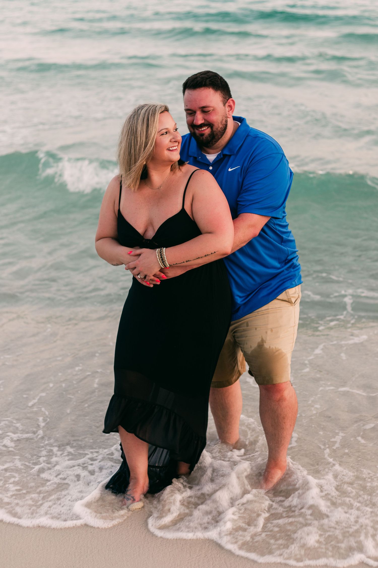
Watches are a bit of a weird one, especially in couple sessions. The big fat circle face of a watch is particularly apparent when people are holding each other's faces and bringing them in for some sugar. Best to leave the watch at home unless its sentimental.
Let's Recap
- Dress for the season
- Dress for the location
- Complement - don't match intentionally
- Wear something comfortable that you feel like yourself in
- Natural fibres and earthy colors look amazing in most settings
- Avoid large prints, logos, and patterns (unless it helps tell your story)
- Throw some accessories like a hat or denim jacket into your bag
Thank you